
The API works. The button technically submits. The page does not crash.
Yet users keep tapping twice, losing form data, missing controls, or wondering whether anything happened. From an engineering view, the feature may be correct. From a product view, it still feels unreliable.
That gap is where many software quality problems live. Functional correctness means the system performs the intended operation. Interaction quality means people can understand, control, and recover from that operation without friction.
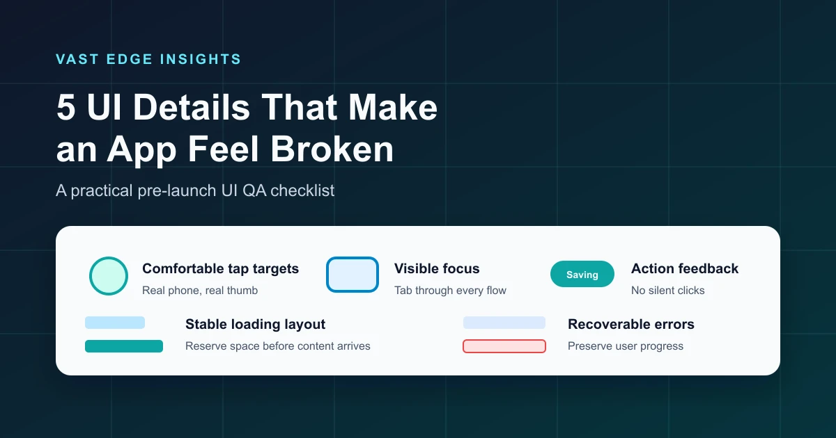
Use the following five details as a pre-launch UI QA checklist. They are not about adding decoration. They are about making the working product feel dependable.
1. Tiny Controls
Small buttons and cramped icons are easy to miss, especially on phones. A neat 16-pixel icon can still sit inside a larger clickable area.
WCAG 2.2 Target Size (Minimum), Level AA, specifies that pointer targets should be at least 24 x 24 CSS pixels, with defined exceptions. That does not mean every visual icon must look large. A small icon can sit inside a larger clickable area. It also does not mean AA universally requires 44 x 44 CSS pixels. WCAG Target Size (Enhanced), Level AAA, uses 44 x 44 CSS pixels, and that larger size is often a good practical design goal for touch-heavy interfaces.
The quality issue is not only compliance. Tiny targets make users slow down, zoom, mis-tap, or avoid actions.

Practical QA test: open the interface on a real phone and use it quickly with one hand. If common actions require careful aiming, the target is probably too small or too close to another control. Give important actions generous hit areas, enough spacing, and labels where icon-only controls are not obvious.
2. Invisible Keyboard Focus
Keyboard navigation is a basic part of web accessibility and a useful quality test. If you put the mouse away and press Tab through the page, the interface should tell you where you are.
WCAG includes keyboard access requirements and a Focus Visible success criterion. The practical mistake is familiar: a stylesheet removes the browser outline because it looks "ugly," but no replacement focus style is provided. Now links, buttons, tabs, form fields, and custom controls may technically receive focus while the user has no visible clue.
That makes an app feel broken because navigation becomes invisible. Users cannot predict what Enter or Space will activate, and mouse testing still appears normal.

Practical QA test: put the mouse away. Press Tab through the page from top to bottom. At every step ask, "Can I immediately tell where I am?" Then use Shift+Tab to move backward. Keep the browser outline or replace it with a strong custom focus style that is not hidden by overflow, sticky headers, dialogs, or animations.
3. Buttons That Give No Feedback
A user presses Save. Nothing visibly changes for 800 milliseconds. The user presses Save again. Now two requests exist, or the second click creates confusion.
This can happen even when the backend is fine. The missing piece is interaction feedback. A meaningful action should show that it was received, is in progress, succeeded, failed, or needs attention.
Do not treat "disable every button" as a universal rule. Some actions should remain available, some long tasks should support canceling, and some retry flows need a button to stay active. The principle is simpler: communicate the current state and prevent accidental duplicate work where duplicate work is dangerous.

WCAG Status Messages, Level AA, is relevant when status updates are implemented in markup. Important status changes should be programmatically determinable so assistive technologies can present them without forcing focus to move.
Practical QA test: slow down the network, trigger a save, upload, checkout, search, or form submission, and watch the first second. Would a normal user know the click was received?
4. Layout That Moves Under the User
Unexpected movement is one of the fastest ways to make an interface feel unstable. A user reaches for a button, an image finishes loading, a banner appears above the content, and the button jumps away. The app did not crash, but the user no longer trusts the screen.
This is the same family of problem measured by Cumulative Layout Shift, one of the Core Web Vitals. CLS is specifically about unexpected layout shifts of visible content. You do not need to turn every product QA session into a performance audit, but the lesson is useful: reserve space for content that will load later, avoid inserting banners above active content, and be careful with late font, image, ad, and API-driven changes.

Practical QA test: throttle the connection, clear cache, reload, and watch the page. Then repeat while trying to click an important control as soon as it appears. If controls move after they look ready, fix the layout before launch.
5. Errors That Destroy Progress
Few UI problems feel worse than completing a long form, submitting it, and losing the entered data because one field failed validation.
WCAG Error Identification, Level A, requires automatically detected input errors to identify the item in error and describe the error in text. WCAG Error Suggestion, Level AA, applies when correction suggestions are known and safe to provide. W3C form guidance also recommends clear overall and inline feedback.
The usability bar is higher than "show an error." A good recovery flow preserves valid values, marks the failing field, explains what needs to change, and helps the user continue without starting over.

Practical QA test: submit forms with one invalid field, expired sessions, slow connections, duplicate records, missing files, and server-side validation failures. Confirm that recoverable user work survives and the next action is obvious.
A 60-Second UI Quality Check
Use this before launch, before demos, and before handing a feature to a client:
- [ ] Can common controls be tapped comfortably on a real phone?
- [ ] Can the interface be used with keyboard navigation?
- [ ] Is the visible focus state obvious at every step?
- [ ] Does every meaningful action produce feedback?
- [ ] Are duplicate submissions prevented where they would cause problems?
- [ ] Does content remain stable while loading?
- [ ] Are images, banners, and data blocks given reserved space?
- [ ] Do form errors preserve recoverable user work?
- [ ] Does each error identify the field and explain the correction?
- [ ] Can a user recover without calling support?
This checklist is intentionally small. It catches issues that automated tests often miss because the feature technically works. The question is whether the product feels trustworthy while someone is using it.
Final Thoughts
Polish is not merely animation, gradients, or visual design. In a serious business app, polish often means the opposite: controls are easy to hit, focus is visible, actions acknowledge the user, layouts stay put, and errors help people recover.
Those details reduce repeated clicks, accidental submissions, missed controls, abandoned forms, and support requests. They show users that the product understands their workflow, not just the database operation behind it.
For more practical software quality and product interface guidance, visit the Vast Edge blog. If your team is preparing a web or mobile app for launch, explore our software development services or contact Vast Edge Services.